Rutager here, your cub reporter- Cub Cadet- space cadet fresh from this years American Craft Council Show. I brought my camera with, but didn’t get too many pictures because I started feeling like I was offending people by asking if I could take them. It was a bit weird, when I would ask, several said that they were on their web site and I could see them there, others reluctantly let me and others had no problem!
The show had something for most everyone, there were textiles, jewelry, furniture, and more furniture, boxes, metal sculptures, glass work, ceramics, painting and more. I ended up joining the organization since they had a reduced fee and it included admission, and the bi-monthly magazine looks very interesting. I found several things that interested me including some ceramic dish ware and wall hangings by Lori Katz, what I liked about her work was that she didn’t use actual black and white stoneware, but rather a light cream color and a very dark brown, which isn’t quite as stark as black and white. I also liked the framed art series called “relief circles” which kind of highlight the negative space rather than the positive. I can really see getting pieces from both of these artists once my many home remodeling projects are complete.
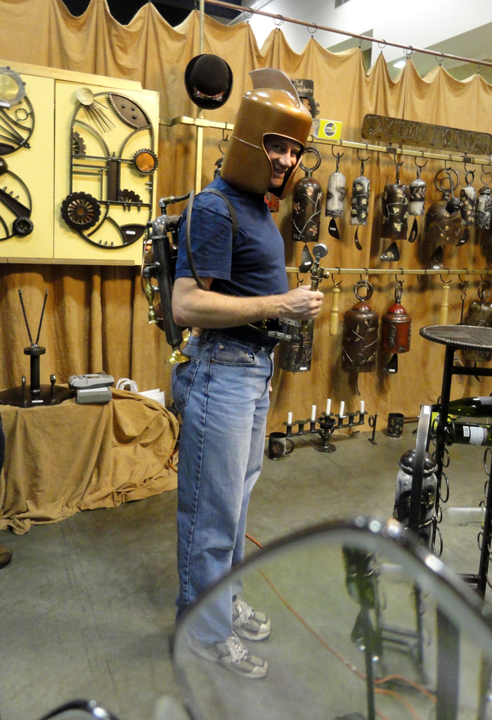
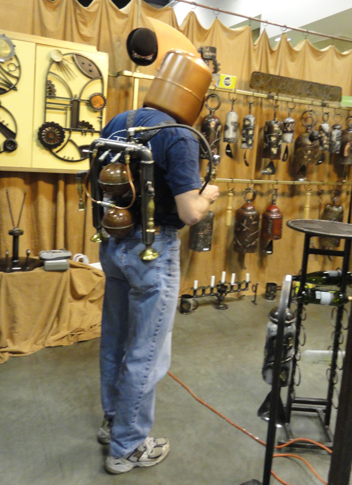
Here I am as a model for Ed Kidera’s rocket pack–this drew quite the crowd (but no autograph requests);
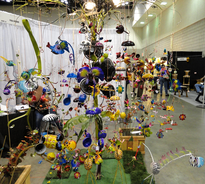
Here are some very colorful hanging animal sculptures;
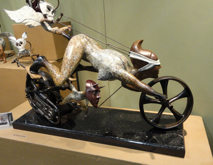
Below is a bronze sculpture titled “Life in the Fast Lane” by Thomas Wargin. Thomas was very nice and explained that this sculpture is about business people who rush into things without concern for scruples and won’t slow down to live life. The little devil guy holding the one blindfold represents unethical and evil acts that the business person turns a blind eye to, and the death masked dude perched on the butt with the other blindfold signifies life passing them by.
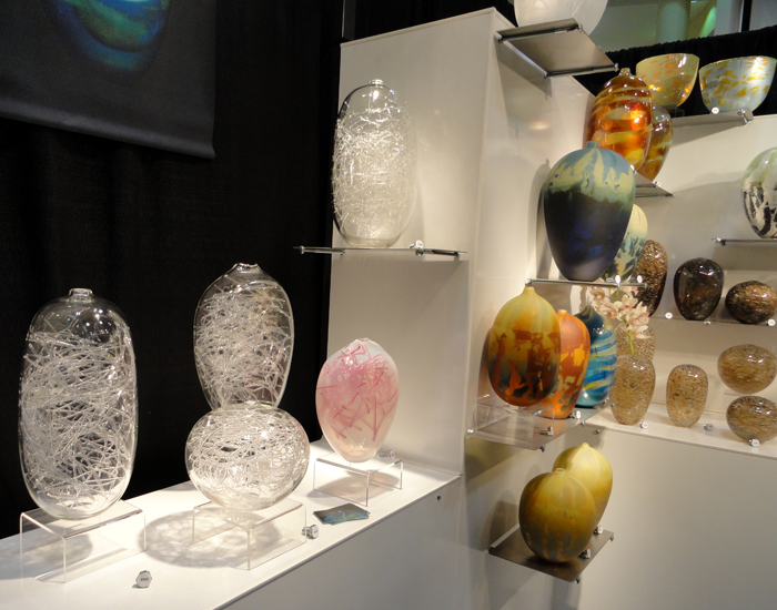
Here is some of the blown glass;
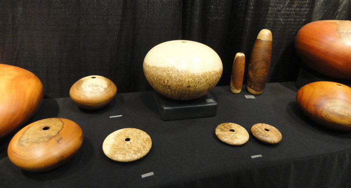
Hollow turnings;
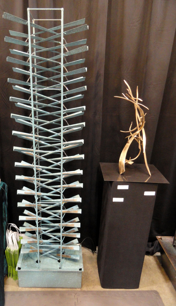
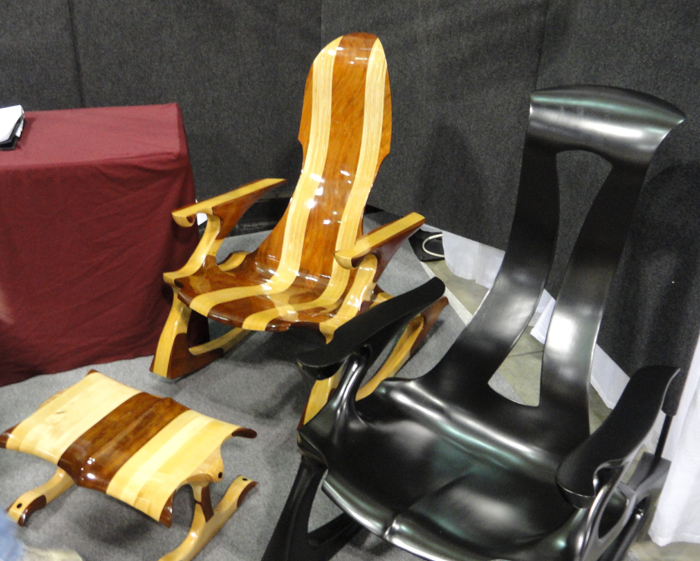
Some metal work and a rocking chair with a futuristic look;
 \
\
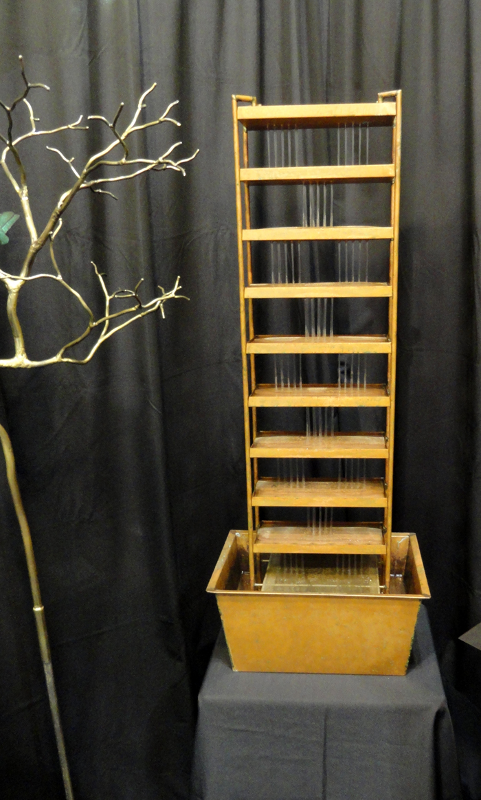
These water fountains (mostly copper) were very quite because at each level the water was landing on copper mesh;
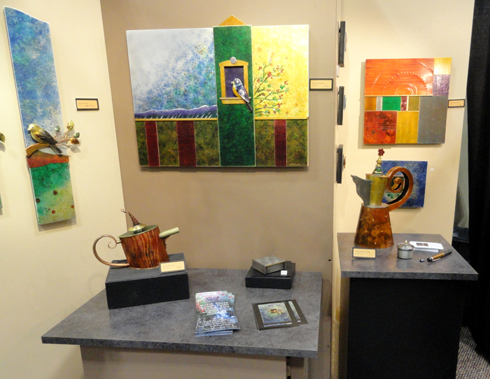
More cool work;
Well… that’s all I have. John, thanks again for bringing the show to my attention.
-Rutager

Rutager;
Thanks for sharing!
The ACC show in San Francisco in the late 1970’s was a big deal in my furniture making career. I think they are an incredibly inspirational gathering.
And for those of you that do not receive “American Craft”, it is a great resource–an evolving record of our creative spirits and my most anticipated magazine subscription.
-John
Rutager,
Great pictures and descriptions except for that bizarre looking dude at the beginning. Any chance of getting rid of him as he disrupts the harmony of the other pictures. 😮 I wish I had been there with you. I think I would have walked you around the whole place dressed as the space cadet. 😮
Some really amazing work in all different types of medium. I loved the rocking chairs as well as Thomas Wargin’s work even if it is a bit freaky. It must have been a lot of fun walking around the Craft show. Thank you.
Fred
John,
Surprisingly, no one asked for an autograph, none of the ladys gave me their phone numbers or threw their undergarments at me- guess it’s time for a new look- maybe less copper?
I had a good time and had my brain “shoved” around in my skull, getting me to think in new ways and filling my mind with new ideas!
I do have a design question for you involving contrast: What ratio should be used for the best effect? I’ve noticed a lot of studio type furniture tends to use close to half and half of say maple and cherry or birch and bubinga like in the rocking chair. I do like these combinations, but to my eye, I think that one color should be much more dominant. Any thoughts or design rules you could share?
Thanks, Rutager
P.S. Tell Fred that any more smart alec comments and I’m “lighting up” the rocket pack and doing a kamikaze mission on The Entertainment Center!
Rutager;
My personal opinion is that if contrast detracts from the form, then it is superfluous–and should be rejected.
Contrast should always add, accentuate, and be harmonious with the form, not an afterthought or a “no” thought effort. For example, the world does not need another oak cutting board with a purpleheart racing stripe. (My opinion)
Think of a thin inlay border offset from the edge used to accentuate the form of a door/top etc. as an example. The contrast is used to emphasize the form and in this example, adds to the piece (or should).
Contrasting woods is a very slippery slope and used too often without forethought. In my own work, I would use ebony or rosewood for small pulls against walnut/cherry/koa and maybe against holly too for the black/white visual tension that can be created. It was almost always subtle.
Good designers go to great lengths just to get the grain of multiple boards of the same species to be harmonious with each other, let alone contrasting species. Also, remember for example, walnut ends up looking like cherry and cherry like walnut…. Some folks like sapwood streaks, others despise them and these are usually small so anything bigger is usually not a good idea. There are exceptions (chess boards for example)…
Go back and look at the work of Castle/Maloof/Krenov/Esherick/Nakashima/Eames/Wagner to name a few and you, will be hard pressed to find pieces with burdensome contrasts–this is for a reason. Castle for example made a polka dotted grand piano that worked but my guess is if anybody but Castle did it, they would be suffer much scorn. Rules are meant to be broken so go at it if your heart gives you a green light!
Hope this helps.
–John
Great post, Rutager! I’m thinking that if you ever lit up that rocket pack, you’d pretty much burn your butt off. Ow!
Thanks for sharing your pictures. I wish I had been there with you. I had a girlfriend whose father was a pretty famous stained-glass artist – he used to write articles for American Craft. He kind-of got me into more creative woodworking, and thinking about “craft” in a larger context.
Nice essay on contrast, John. I recently built a cabinet out of highly figured bookmatched cherry, with a racing stripe of maple. As soon as I put the doors on, I’ve regretted the maple stripe in the cabinet case – it detracts from the maple door handles. Oh well – learning experience…
– Peter
P.S. I’m hoping that the choice of avatar is some random image generated by the computer. Otherwise I’m insulted. Goofy pink gearhead indeed!
Peter; well…you could send us a pic of said cabinet and in consideration, you may win a coveted award…carrots come to mind…
-John
Thomas Wargin explaining his work to Rutager reminds me of a ceramic craftsman I once met. He had graduated from a prestigious art school, but lamented to me that most of his education had been addressed toward how to explain and defend his art, rather than create it.
I wonder if Wargin is taking a jab at women in business, perhaps Martha Stewart, with his depiction.
Actually Alex, I think Wargin was targeting me…
-John
Don’t fret Peter–the computer did indeed generate your avatar.
I don’t know how these got turned on, but they did, and are much like horoscopes–we see/believe the pertinence if we believe there is pertinence. Look at mine…must be time for payroll….
–John
The avatars are a WordPress thing. You can change them by logging into your WordPress account or using the Edit My Profile link in the upper left corner of the page. (Yes, you do have a WordPress account, by virtue of posting here, even though you may not be able to get to it directly from WordPress.)
Had I known that my Lilac-breasted Roller would follow me everywhere I go, even to my work-related websites, I might have chosen something else…
-Steve
My avatar appears to be licking whatever is dripping from his nose and also seems to pretty excited by it- yup, they’re spot on!
John,
Peter posted his shoe cabinet on talkfestool a while back, and there is no way it could have anything to do with carrots! His use of contrast on the front is excellent, the stripe on the case isn’t bad, but might have been better without it, but there won’t be any bunnies making it their home!
-Rutager
Thanks Rutager!
– Peter