___________________________________________________________________________________________________
“Just because you’ve always done it that way doesn’t mean it’s not incredibly stupid.” –Unknown
___________________________________________________________________________________________________
I have wanted to attend the Milan Furniture Fair since my furniture making days in the 70’s. It is the largest concentration of furniture design talent on the planet.
My reason for attending this year was simply to recharge my batteries, and hopefully get inspired–particularly by the several hundred young designers from the world around who were juried into to the show. I really like the work of young folks, their ideas are so cool, and most are unfettered by bias and constraints that “normal” folks would dismiss.
The show is spread out over 20 halls and occupies 2.5 million square feet of display area. The exhibitor count was roughly 2,200. If you are not interested in furniture and find yourself in Italy, then I suggest the Amalfi Coast or Lake Como.
The displays for the hotel industry were unbelievable. Entire bedroom suites were set up, down to the flowers in vases–if you walked in blind folded you would think you were in a hotel room. There were complete hotel lobbies, casino lobbies, elegant waiting rooms, and this was just in the first two halls.
Two halls were dedicated to kitchens. One for bathrooms (I particularly liked the horizontal showers–the models were distracting however) and there were six or so halls dedicated to “modern” furniture. I will touch on all of this as time allows.
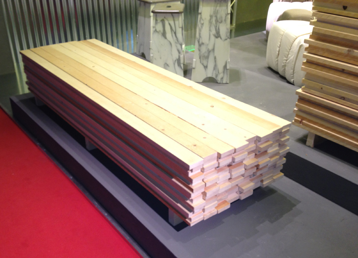
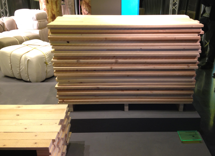
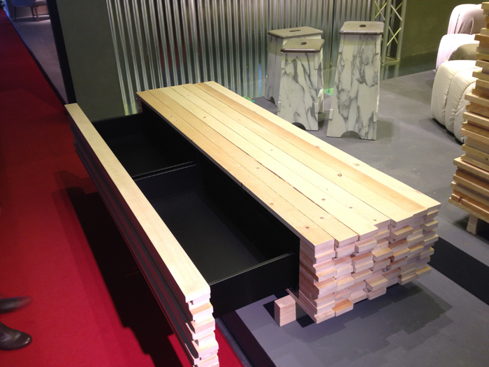
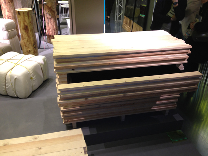
While sorting my images, I came across a couple that were hard to classify–they are pictured below.
On the last day at the fair I walked by this booth not sure of why they would bother displaying stacks of lumber smack in the middle of the booth…

In the right environment, think industrial loft living, these pieces would be right at home.
–John


Definitely not my style of furniture, but great ingenuity nonetheless. Now, if it were a big boulder that had drawers, THAT would be cool. Noguchi meets IKEA.
— Peter
The “board furniture” is wonderful! Such a very clever idea although I’m not sure how the rest of the room(s) would be decorated. The Milan show had to be very inspiring indeed.
Peter, et al,
I don’t think it is anybody’s style…that’s what makes it interesting and fun.
-John
How about cabinets at a large corporation- in their “board” room!
Thanks for coming, I’ll be here all week.
-Rutager
And to see more, the Industrial Design clearing house website, Core77, always has nice daily blogs about it as well.
http://www.core77.com/blog/salone_milan/default.asp
Paul
Geeze John…
I’m trying here…You went to ITALY to see the world’s most astounding display of art and craftsmenship….I think there is a subliminal message here. I think that Fred West’s entertainment center has left a mark on you…
Dennis
Now that I’m thinking about it, I’m starting to worry about the CT-19…It might be the BCT version of a Saws-all..
DJ
I spoke with Fred West recently and he told me as soon as he finishes his workbench, the very next project is ….. You guessed it!
-John
Fred:
Please hurry! I worry!