___________________________________________________________________________________________________
“A writer should write with his eyes and a painter paint with his ears. –Gertrude Stein
___________________________________________________________________________________________________
Dear Drivel Starved Nation;
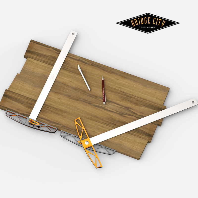
For the past couple of months I have been playing with a locking lever for the redesigned AS-24 that does not hurt my fingers. As mentioned earlier, both of my index fingers have been visited by Uncle Arthritis.
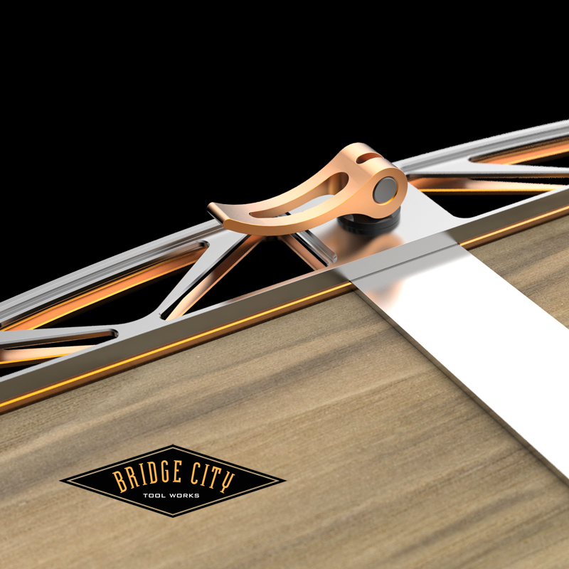
I am actually glad this has happened, it is an inconvenience that has made me shamefully aware of how ignorant I am regarding disabilities. Now I have a new palette of constraints to consider in my design work. The first result is the new locking system for the AS-24v3 which will be released for pre-order next week.
This lever can be locked with the butt of the hand and released by pulling or sliding one’s hand underneath. It works for healthy hands too.
The AS-24 was one of our best selling tools throughout the 80’s and 90’s, and we have not made them in about 10 years. This batch will be limited to 250 units. So if you are looking for a great way to replace the need of a framing square at the bench and have the ability to set angles, this window will close fast. Unlike the two older versions, this version does not come apart–FYI.
The following cell phone pics are from the 2012 Milan Furniture Fair, and maybe they will be of fun interest to you as well…
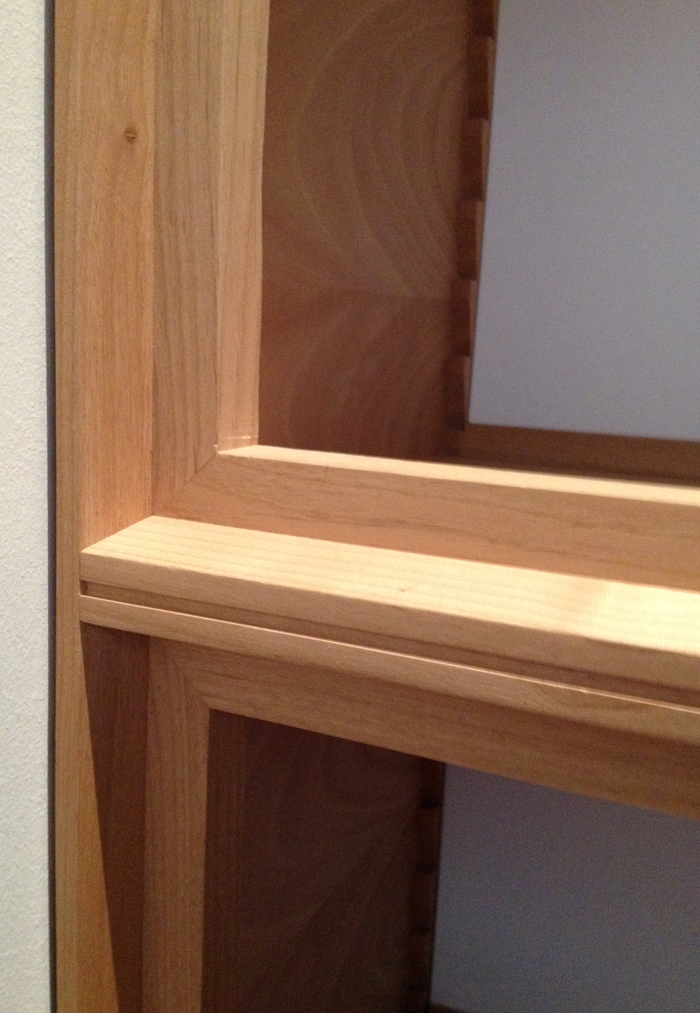
My favorite topic that is ignored by many avocational woodworkers is the need for texture (shadows). The image below caught my eye because; it is simple, easy to reproduce and is nice looking–our eyes like to eat too! Anyway, for those of you who like contemporary grace, here is one for your idea file:
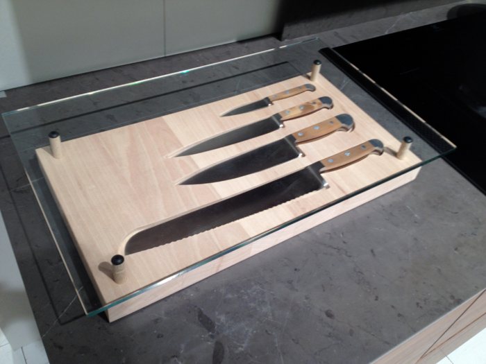
One of the major themes repeated by exhibitors was space saving design. Many of the ideas are ingenious and cool–as in this example, the knives are accessible underneath the glass top which has the silicon cutting sheet removed for clarity. I liked it for both the utilitarian space savings and the convenience.
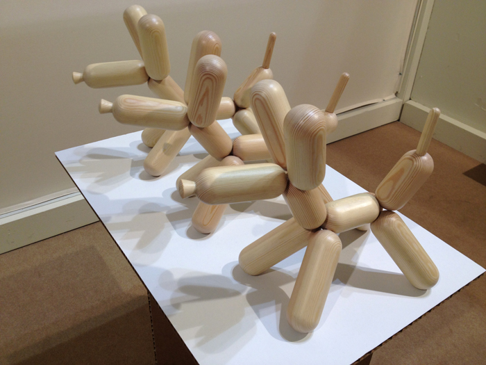
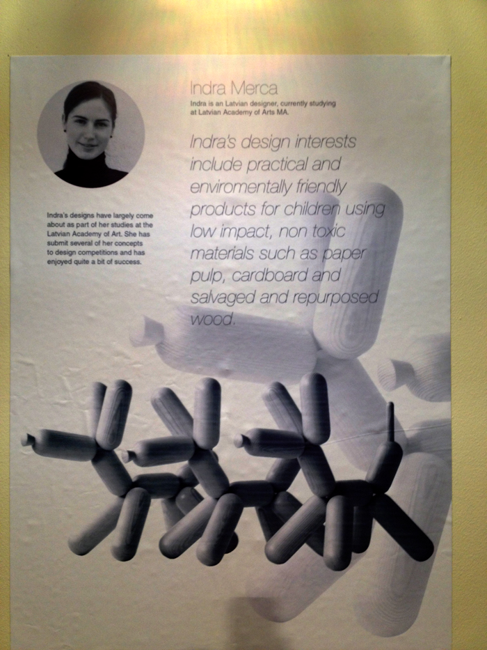
As mentioned in a previous post, I thoroughly enjoyed the design work of the juried young designers from around the world. I loved the playful simplicity of these turned “balloon” pooches and would buy one in a heartbeat for the entry of my home–one, to watch my dogs freak out, but also because it is plain fun–I think they are really neat and will never run out of gas. Come to think of it, neither do my dogs….
Lots more Milan stuff over the coming months–until then, here is a pic I took in Indianapolis. Save? Yikes.
–John


John,
Wow! The new AS-24 is beautiful!
Looking at the first picture from the MFF (not to be confused with Paul-Marcel’s MMF), my eye was drawn to the blemish above the not-quite-perfect mitre. Anybody else?
Chris
I noticed that blem too, Chris. But I guess we were supposed to be paying attention to the shadow lines…
Love that AS-24. As I mentioned in the earlier post about it, I wonder why you didn’t take the opportunity to make some circles in the handle (like the sides of the CT-17), or build-in some angles in the ribs (45, 22.5, etc.) so that it would be quick to line them up when you rotate one of the handles.
— Peter
… Actually, the more I look at it, the more I like the diagonal ribs that you chose…
— Peter
When the ‘square’ leg is down (so the straight edge is square to the reference), it would be nice to have a rule on the side of the blade that’s up. I realize that makes no sense on the side visible when using the bevel leg, but square would be nice.
I’d go for a Metric/laborious-fractions version with the Metric on the right-hand side.
Peter,
The CT-17, 18, and the new AS-24 share a design theme. “_ _ _ _ _ _” City Tool Works”.
🙂
John
Let’s see: 6 letters, modifies “city tool works”. Hmmm. “Carson”? “Kansas”? “Island”? Yow – this is hard!
Tee hee – just teasing. So I guess you’re not going with the same kind of bridge for each tool?
And back to Milan: I don’t mean to be dense, but isn’t it fairly impractical to store your knives under a cutting board where you can’t see them? Or maybe I’m misunderstanding what I’m seeing. It seems like it would be awkward to have to reach under the glass to pull out the knife. But I like the idea of the knife-shaped depressions. That would be nice to have in a drawer.
— Peter
Peter,
The cutting mat is removed. There are only 4-5 knives,in a progression no less, so from a space saving perspective, which is GROWING need, it is a fun alternative. Takes two fingers to remove and insert a knife, I tried it. It does look cool and with the glass top, there is zero loss of counter space until cutting time. It’s not for everyone but it is interesting.
If one can remember all 88 keys on a piano, 4-5 knives should be manageable for the rest of us…
-John
Most professional chefs only regularly use two knives: A chef’s knife and a parer.
All the others are luxuries, not necessities.
Having said that, I really love my Shun Chinese Vegetable cleaver. There’s nothing better for fine slicing and dicing. It’s what Bridge City would make if they made knives!
David
John:
Why max at 250 rather than set an order window?
Tangentially, in trying to figure this one out myself, I looked up the significance of the number 250 and found out that as a Mandarin slang term, 250 (二百五 pinyin èrbǎiwǔ) is an insult meaning “stupid person” or “simpleton.”
Dave
Dave:
We have stock on hand for the 250. The minimum order for the precision straight edges we use for the blade would give us a 5+ year supply–not willing to to take the risk.
Maybe that makes me a Simpleton, and I am cool with that!
-John
Thanks, John. My best guess was that some weird hink in production made 250 some sort of sweet spot on cost, but I couldn’t guess what it was. My worst guess was that this was going to be a “chase” item a la the stainless shoulder planes 😀
I always find stories about how things like material costs or business risk, etc., drive design decisions to be interesting. I’ve been guessing about how such things play out as Bridge City moved from its brass and rosewood aesthetic to more stainless and annodized aluminum.
Simpletonly yours, Dave
John,
Big fan of your locking lever; first used it on the CT-15 and was thrilled that someone came up with such a solid locking device for bevel gauges. The fact that it is also easier to operate, well, that’s just frosting on an already delicious cake.
Thanks,
Rutager
John,
does your second offering of this tool have “V2” on it? What is the easiest way to differentiate between V1 and V2?
Thanks,
Dennis
Dennis-
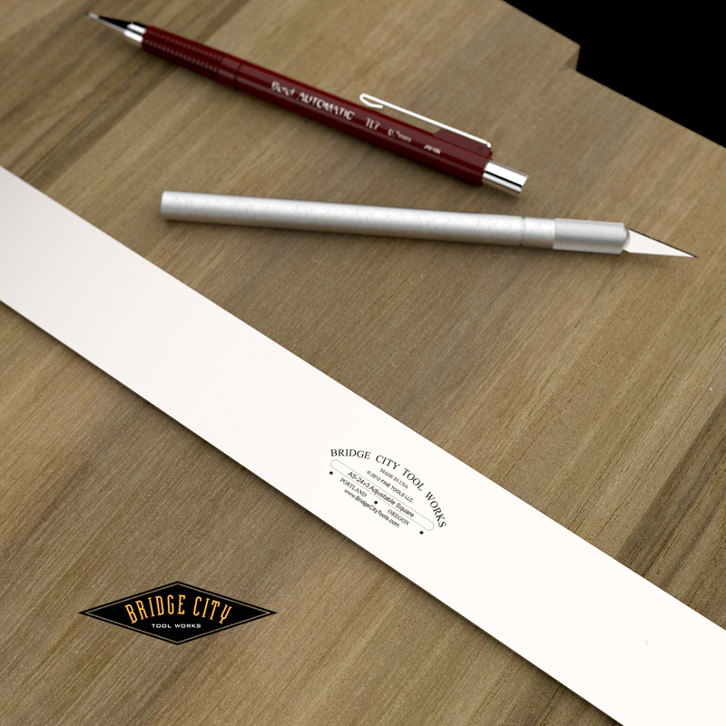
This is actually the third version of the AS-24. The first was a rosewood head with brass face plates. The second was a solid brass head with rosewood infilled cheeks (too heavy looking back). And yes, this tool is marked v3 as seen in the image posted on this totally awesome and worthless blog.
-John
Show of hands please…
Would you like graduations (both Imperial and metric) etched into the blade on the side that is permanently square? It will add about $25 to the cost.
Let me know–it will be dead accurate to the reference edge.
–John
PS: This was requested by Paul-Marcel and it just might be his very first good idea! 🙂
I’d vote for graduations on the blade.
Excited to the evolution of this back in the line, John.
I have one of the original V1 units. Might have to ebay it and move to this one!
neil
John,
Yes please, pretty small cost to add some more function to a tool.
There is a rumor going around that Paul-Marcel actually had a good idea prior to this one, but it can’t be verified.
Best,
Rutager
At “first glance” you think of using the straight edge portion of the square to draw lines, but where do you place the lines? Often there are a repeating series of lines and having a quick reference on the square is a cool idea. I think these should be the same format on both sides of the square however (either metric or imperial) since you will probably be using both sides of the square while marking.
DJ
I vote not. I think an adjustable 0 point is much more useful and you get that by laying a graduated rule along whatever straight edge you use.
This looks like a great companion to the Angle-Master.
John
It may be possible to make this plain, all imperial, all metric, or a metric/imperial combo. In other words, any way you want it. It is just a matter of creating 4 SKU’s, the setup charge would be the same I believe.
I will know more tomorrow.
Thanks for the feedback!
John
I’m of two minds on the graduations. On the one hand, it will save having to measure and then mark with two different tools. On the other hand, the thickness of the blade gives a good possibility of parallax making your marks inaccurate. I like the way the Woodpecker rules have sloping sides so that the marks are almost on the piece. And, though I’ve never used it, the Incra rules with all the little holes look practical for drawing lines parallel to the edge.
On the whole, I think that having the graduations would be useful, though the thickness of the blade (and therefore distance of the marks from the piece) worries me.
— Peter
John,
I guess I’m a little late, however, I too would like to have graduations on the blade. It would save a second step when marking work.
Allan
Peter-
Don’t worry about parallax error- your tool potentate hates parallax. 🙂
As Chief Inspector Clouseau so eloquently stated;
“Case solve-ed”
John
Clouseau also said, “Is that your minkey?” among other things…
Looking forward to your parallax solution.
— P