___________________________________________________________________________________________________
“It’s really hard to design products by focus groups. A lot of times, people don’t know what they want until you show it to them.” –Steve Jobs
___________________________________________________________________________________________________
Dear Drivel Starved Nation;
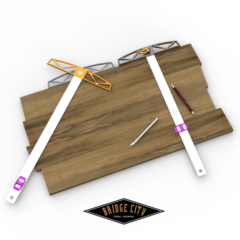
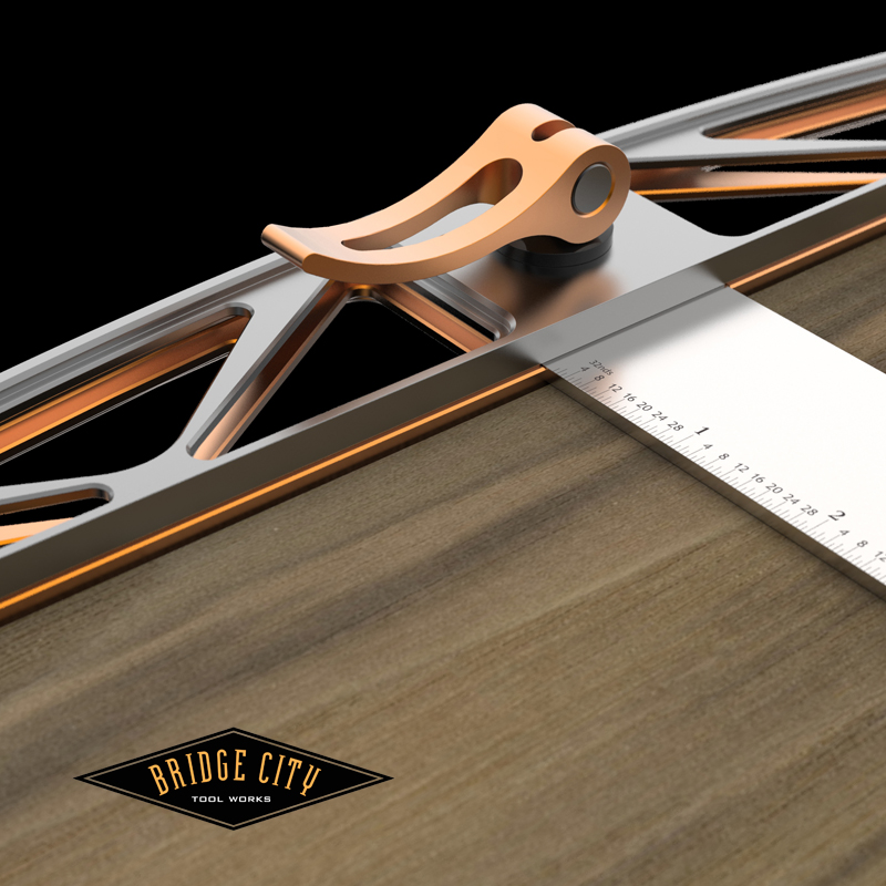
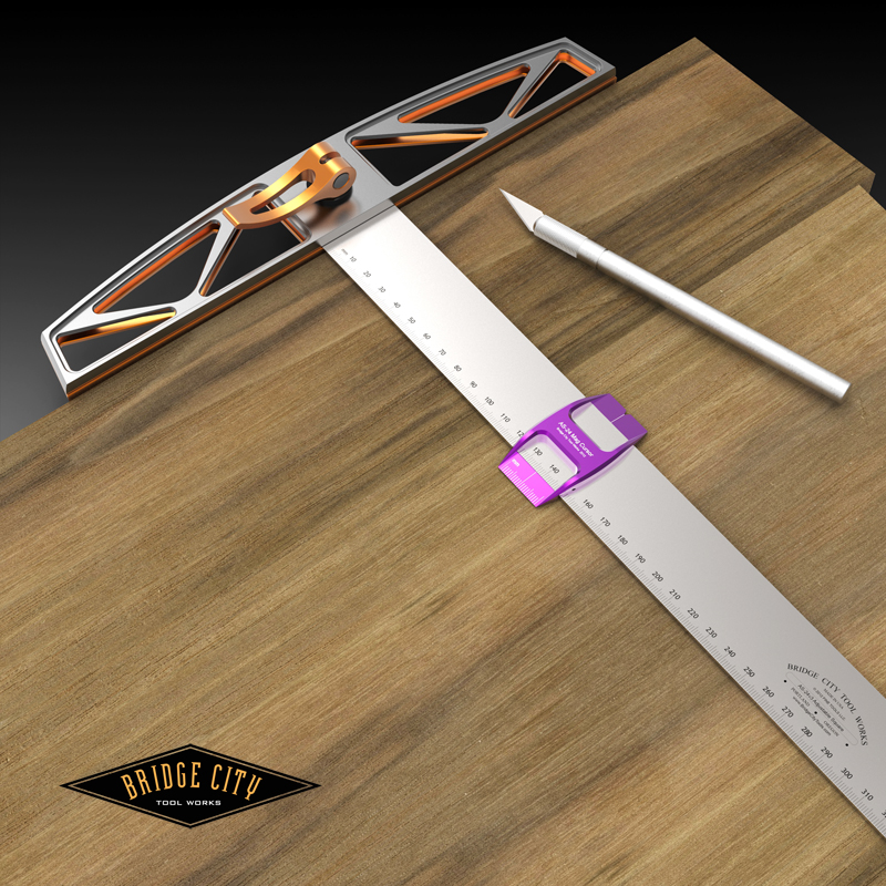
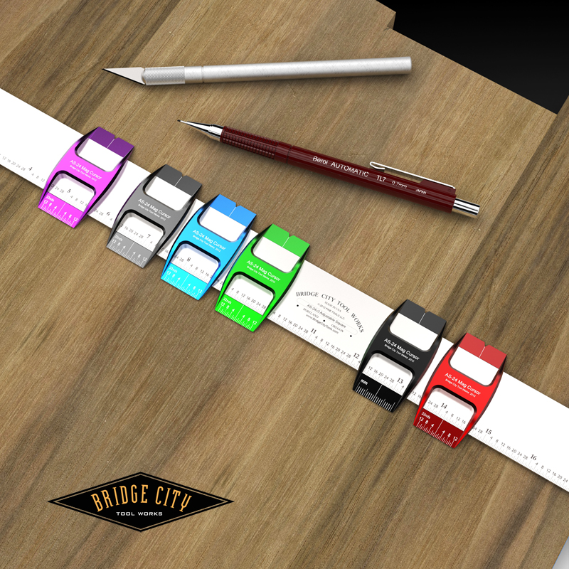
Thanks for the AS-24v3 feedback over the past couple of days! Here’s imagery of the final design. The retail price of the AS-24v3 is $289 (Founder’s Circle get a 10% discount off this price). We are still waiting for pricing on the cursors, and they will be sold individually in whatever three colors the DSN deem appropriate.
Please comment on your favorite three cursor colors and we will open this for pre-orders in the next week or so. As mentioned, we are only making 250. If you don’t get in on this run, we are going to make the AS-24v3 a Bridge City Essential which means we will make them at least once a year.
Lastly, we are not going to make a hybrid imperial/metric–the ability to storyboard on this blade is too important.
–John


Brilliant idea to have multiple, multi-colored cursors for using the AS-24v3 as a story stick. Oh wait. I had that idea in the previous blog post! 😉
This is going to be a serious tool. Nice work – as always!
— Peter
John,
I’m voting for a color not shown; and that is the orange that is already on the head. I’m also voting for the grey, black and if orange doesn’t count; green.
$289? Michael told me mine was $8,000- what should I sent you?
Thanks,
Rutager
Rutager,
Michael is always correct, send the 8k.
No on the orange–it is part of a color scheme here that has meaning–and white does not contrast well at all on orange.
Once we receive the 8k however, an exception might be considered. If that sounds slutty, then yes I am.
–John
Red, black and green would be my choices, but I’ll buy three of whichever win.
Well done John!
I like the red, green, and gray.
Put me down for one. I have the original and looking forward to the V3 with the scales.
Looks like another very beautiful tool. I wish I could contemplate buying one.
Quick idea though: how about a vernier cursor?
Also, a deep blue cursor would look very nice imo.
Andy 🙂
Okay: colors. Gillian first went with gray, blue, green. But then she decided gray, black, red.
And she’s always right. (She added: green and blue are the more feminine.)
So there you go.
And yes, it seems fair that Rutager pays $8000 for his. Each. And I think he needs two.
— Peter
So Rutager is getting 2? Probably… so he can leave one face up and one face down to save time on the flip.
I like the grey, purple, and black. Blue and green look nice, but also look like the white markings will be difficult to see.
I agree with Paul-Marcel. The images show less contrast between the white graduated markings on the green and blue cursor bodies? The other four colors “pop”.
I can misread anything, so to increase the odds of seeing the right info I choose BCT purple, black and red. John should declare purple Fait accompli.
Never thought that choosing a woodworking tool will end up like choosing an iPod nano :0)
White with polka dots please.
Yeah, the purple rocks! If I got the red, I might mistakenly put it in the Woodpeckers drawer when I’m done =:-O
I really like the red one. The black one also does show up nicely.
I was looking at this today and thought that you COULD create a double (imperial and metric) scale on one side of the piece and use the “hole” in the cursor to align with either an imperial or metric scale as you wish, and leave the opposite side for story stick use. It might be a bit less aesthetic, but would add functionality to the piece. Since there are no trade-ins on my (quite valuable) framing square, I’m having trouble deciding which scale to buy.
Dennis
There’s no color like grey! Although if you made the top red instead of orange, red would also look nice. I am always a fan of using color sparsely, and to make other features pop. If you add too many colors in one tool you will muddle up your otherwise clean and elegant designs.
Red, black, and purple, because in the shades shown, they have better contrast.
“Window”? “Get in on”? The experience of buying is quickly taking on the feel of buying playoff tickets! 😀
Definitely Black. When in doubt, always Black. Happy to see this updated version, my rosewood original is a beauty but I don’t want to use it in the cabinet shop. Nice work fellas!
I’ll vote for fuschia, mauve and heliotrope. IOW, the purple, green and red so they will be distinguishable from the rest of the stuff I have in my BCTW drawers.
The ship may have already sailed on this one, but what are the design trade-offs to making the left side of the cursor square to the blade?
I imagine making my story mark on the blade and aligning the cursor side to that mark. Then we could mark a line all the way along the blade to the story line (something not possible without removing the cursor now).
The center window would be maintained for the original intent.
Matthew-
If I understand you correctly, you can do this with the existing cursor. Here’s how;
Layout your storyboard pencil marks on the blank side of the blade. Next, align the internal cursor to the pencil mark (these surfaces will be flush).
Lastly, take your marking tool awl, pencil or knife and place in the notch of the cursor and using both hands, scribe your line parallel to the reference surface.
If I am not understanding this correctly, send me a doodle–it is too late for this run, but we can always offer auxiliary cursors should there be a demand.
–John
here’s a quick sketch:
https://dl.dropbox.com/u/875047/images/cursor.jpg
This is for marking perpendicular to reference surface.
When my JMP arrives, it would be well suited to making one of these cursors with a little help from kerfmaker and DJ-1.
Got it–I never claimed to be smart!
The current cursor center-line is approximately 0.625″ from the reference face, so yes, that area is no-mans land for layout with the center-line notch cut into the cursor.
Let’s see how big an issue this is–from my perspective, layout lines that close to the edge are better served with a marking gage.
Thoughts?
–John
haha, It’s hard to describe when being so abstract. Let me try a usage example and see if that clears things up.
I want to layout a mortise on several boards:
https://dl.dropbox.com/u/875047/images/mortise.jpg
–I’ve drawn light lines using the cs-2 with the mortise attachment (dotted blue lines).
–Now need to place the mortise in the right place (red square).
I could place two stops on the square to describe the mortise placement along the board:
https://dl.dropbox.com/u/875047/images/stop.jpg
This provide a repeatable parallax free edge to mark all the corners (light blue line in inset image).
It’s important to have one curved side and one flat so it’s obvious which side of the stop is the story line.
With edge on side, there’s no minimum distance between two stops (closest two current cursors can be placed is a cursor width apart).
This may very welll be my first project with the JMP.