Drivel Starved Nation:
This Thursday, I will host the final design review for the Chopstick Master—the production prototype is being hand delivered to Portland this week.
Never in my life did I ever expect to be responsible for a product that makes people so happy. Over the last 32 years, it seems all Bridge City has ever accomplished is the ability to piss people off because we don’t have “Made in China” prices. The irony is appropriate I suppose.
It will be interesting to see where all this goes, the numbers are staggering. The CSM should open for pre-orders by the end of August and they should be done in late Oct. – early Nov. Plenty of time for holiday gift giving!
There was an interesting comment on my previous blog post regarding the font used for “Chopstick Master” as being cheap and racist. I am interested if this is a shared view and your comments are most welcome. I bring this up not because I am an expert in fonts, I am not. I bring this up because I am left handed and quite adept at using chopsticks with my left hand, but not my right. I was once told this genetic predisposition could offend people in China, particularly at restaurants. I made several inquiries and was assured that those days are long gone, nobody cares anymore which hand you use for chopsticks. That said, my Chinese counterparts in China thought the font was humorous and insinuated “fun”. I have until Thursday to sort this out.
I have not worked on anything else but the CSM for the last seven months. This week, I began work on Commemorative Tool #19. Before I began, however, I finished up a little project I started late last year, an all aluminum multi-tool. Here’s a pic;
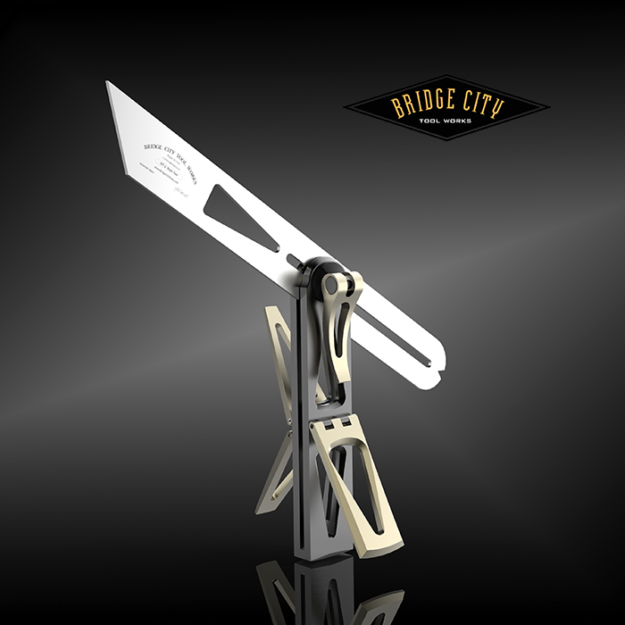
We made an all stainless version of this tool as a one-time run and it was very well received.
This tool features three saddle squares, an 8:1 dovetail cutout in the blade for the layout of dovetails on either straight or curved stock. The little “notch” in the rear of the blade allows you to trap a pencil or scribe and use the tool as a marking gage.
TRIVIA QUESTION: What is the 45 degree bevel on the blade used for? Don’t be surprised if you don’t know the answer, not many do.
As many of you might know, each year I take a two to three week work retreat and hole up somewhere undisturbed and do nothing but design work. If I did not do this, Bridge City would cease to exist — I really can’t get much done in my office (employees, customers, vendors,) or my home (wife, dogs), and the comparison is pun unintended, they all vie for time.
I actually don’t care where I go because I don’t do anything but work. However, the last two years I have gone to Hawaii.
Sounds like a scam doesn’t it?
Being a skin cancer survivor, I despise the sun, so it makes perfect sense to go somewhere where going outside is not fun… except for the expense.
And the expense is why I am pleased to introduce to you Fred Hayden, a fellow DSN member.
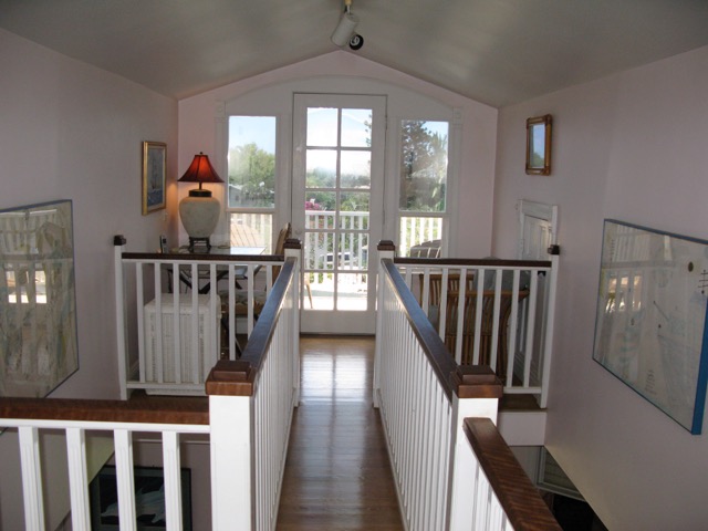
Fred and his lovely wife Linda purchased a bed-and-breakfast several years ago and converted it into a multi-family dwelling. Located in Kihei, Maui, this house is a five minute walk from this beach and yes, this is the real beach;

Interestingly, the beach is about that busy too.
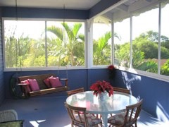
But I don’t hang out at the beach, I hang out here, in this little work space where I employ a big ass monitor and my workstation to create new stuff for you to buy;
I love this little space.
When it is time for grub, I whip up a smoothie and sit here;
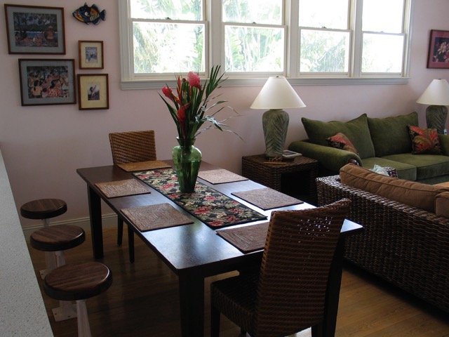
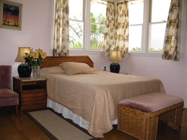
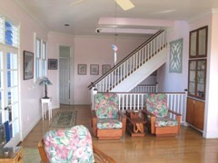
This is a typical bedroom image (there are 3);
Here is another little work area and some other shots;
 So… why am I sharing this with you?
Check this out:
- Spacious 3 bedroom & 2 baths
- Bonus upstairs office, porch & day bed
- Large screened lanai
- Fully Furnished: Washer-Dryer, Grill, DW, AC, WiFi, Cable, Phone,
- Short walk to beautiful Sugar Beach: Cooler, Beach Chairs, Snorkeling Gear, etc.
- Standard Seasonal Rates from $2,125 – $2,650
- 10% Discount off standard rates with mention of Bridge City Tool Works
Caveat: I receive nothing from this other than a big “Thanks” from Fred and Linda. That said, when you consider this house will sleep three couples comfortably, and add in one or two kids, the rates are fantastic. Fred can be reached here: thecabana@sbcglobal.net.
Thanks for hanging out at this Totally Worthless and Awesome Blog!
-John
I’ve always wondered about the 45 degree bevel on the blade of a sliding bevel, the internet (google)is also stymied.
RE: Chopstick Master font. I would absolutely not use the “Chinese Restaurant Menu” font. I was going to mention something in the comments the first time you posted an image of it, but I got distracted by something shiny.
It’s while I am not sure I would go as far as saying it’s blatantly racist, but it’s certainly well within the gray area. It’s certainly about as Chinese as fortune cookies. Moreover, I would say that it’s a not a very elegant or tasteful font. Its sort of politically incorrect Comic Sans (For what it’s worth, unless you are drawing cartoons, I find Comic Sans aesthetically offensive). Considering that BCTW is synonymous with elegant and unconventional designs, that font is completely inappropriate.
DONT DO IT!
On a lighter note: Congratulations! I am really happy to see that you’ve got a real hit on your hands!
Thanks for the subdued feedback! I have always been a subscriber to the “iceberg theory” whereby the sentiment you “see” is nothing in comparison to what lies below the surface. I certainly don’t want to make the next Titanic. I completely appreciate your candor and kind words.
I am listening.
BTW, if I share what that 45 degree thingy is on the end of a T-bevel blade does that make me smarter than the internet?
-John
John,
If you can “fog a mirror,” you will be smarter than the internet average- lots of smart stuff there, just incredibly difficult to separate it from the garbage.
I’ll also vote against the font- better to not take a chance on offending folks with your product, when you do it so much better in person! Okay, okay, I kid. Seriously, why risk having an awesome thing caught up in Internet slandering?
My guess on the 45 degree end is if you set it on a flat surface and bring the body so it is sitting flat on its end. You’ve set the tool to 45 degrees; either that or for scratching your back.
Love the new multi- bevel tool, I saw a similar prototype of the aluminum CT-15 in your offices and thought the black with stainless looked damn sexy.
Best,
Rutager
John,
Had a simple thought recently- piano is often taught to beginners by having them play “Chopsticks,” now maybe woodworking will be taught to beginners by making chopsticks?
Rutager
Rutager-
What the hell were you doing in my office?
Never mind.
Hear you on the font… +3 at this count.
Indeed the little bevel on a t-bevel blade is a quick way to generate a “construction grade” miter simply by aligning the bevel edge to, let’s say one edge of a 2×4, and the body to the opposite edge.
That said, there is more. Big difference between construction grade and furniture grade. Just like 3rd grade and 11th grade, both of which I passed with Congressional help (payola). There. I said it.
🙂
John
John,
During the 30th anniversary open house, I looked through every box, shelf and bin in the office and production floor- I drooled so much, I kept checking my mailbox to see if you sent the carpet cleaning invoice to me. Tried talking Michael into selling me the prototype, but dang it anyways, he wouldn’t budge. Thought about grabbing it and running, but with Consuelo watching the door, I knew I wouldn’t make it out alive.
Rutager
Rutager-
Much of what you speak is plausible.
What documentation can you present to substantiate that you are human?
It is not easy being me.
John
I will jump on the “change the font” bandwagon. For one, I don’t think it’s a very attractive font. And, as mentioned in a previous post, BCTW is all about elegance and form. Second, the font is meant to connote and Asian aesthetic. But it’s on a CHOPSTICK MAKER, for crying out loud! What’s more Asian than that?!? And third, my political-correctness radar was tingling a bit at seeing it. I’ll certainly buy that a Chinese colleague found it amusing. But why not use a western font that represents BCTW, and then have a Chinese and/or Japanese translation using their symbols (they are probably the same) in an elegant font? Hopefully the Asians would respond to the beauty of the calligraphy in their alphabet, and westerners would do the same. Win-win!
P.S. I just had a big glass of single malt, so my brain is addled, but perhaps the 45 degree bevel on the gauge is for bisecting angles for miters or something?
John,
Over the last 30 years of Bridge City Tools ownership, I have never stopped being amazed at the quality of engineering, design, and functionality. If Bridge City Tools starts to listen to the people who expect “Made in China” prices, then it’s no longer your company, it’s theirs. You are making art that people can use. That process and product will always demand fair prices to maintain. Listen to your dream, not someone else’s economy.
Oh, yeah, get rid of the font.
Bob
Hi John,
I wasn’t going to say anything. But since you asked….
My kneejerk reaction when I saw the Chopstick master prototype was that the font was indeed racist. Or at the very least, insensitive and, yes, cheap. Not befitting a company such as Bridge City Tools. Good to know I wasn’t alone in thinking this and being overly sensitive.
I don’t know what the cultural symbolism of the “chinese restaurant menu” font is in China so I can’t comment on your Chinese counterpart’s reaction but keep in mind that being Chinese in China is a very different experience than being Chinese in the US. I wouldn’t be surprised if the font has a very different connotation in China vs. here in the States.
Also keep in mind that East Asians tend not to say “no” in business. It’s considered rude. They’ll say “yes” while meaning “no”.
best,
Roman
I guess I’m culturally insensitive as I thought the font was amusing and that the name plus the font was meant to be fun, but I guess it is best to be safe and avoid offending anyone in these politically correct times.
Cheers
Kevin
Excited for the aluminum multi-tool. Any chance you are also going to make the smaller multi-square in aluminum too (please)?
We were discussing this yesterday. I don’t know why we shouldn’t just offer both, the saddles are identical as is the locking lever. Stay tuned!
-John
Hi John,
Will the CSM require the use of a BCTW plane, and if so, will the CSM be packaged together with such a plane? Thanks,
The CSM is a turnkey product. As of this writing the only accessory that will be available are extra chopstick blanks and sleeves. These will be sold 10 pair at a time. The kit comes with 10 pair. The vast majority of users have zero woodworking experience.
-John
hey dude, congrats on what appears to be a real winner. re: comments on the font, i didn’t find it racist but just felt it was trite. but what the hell do i know? i just recently mastered the recipe for ice cubes and managed to knick myself using both ends of the flushing chisel. more of an expert on bandages than fonts.
re: font again. this is a fun contraption so i would want to be sure that the font is not having fun at someone else’s expense. i don’t feel that it is but maybe getting input from someone other than older white guys might be prudent.
Dave-
First, using the flushing chisels for ice cubes is not an approved or sanctioned activity. The shame you are now feeling must be enormously burdensome.
We are changing the font, working on it right now.
John
John,
Just use the same font that you sign your name with- only the Iowa Board of Education will be offended.
Rutager
That’s a good idea!
I didn’t think the font was a big deal, kinda cool looking if you ask me, but then I started reading some of the other comments, I was turned around. With the type of quality you engineer in your tools, I wouldn’t want a font that looks, dare I say,silly. I would want one the expresses quality and craftsmanship. It takes a lot to change the mind of this dumb kraut, especially since I’m far from politically correct, but the people here who have left a comment, did just so. I think it would be nice if you use whatever font Robert Sorby uses in his logo. Just my two cents worth.
Did Abraham Lincoln really say “Don’t believe everything you read on the internet”?
By the way, I’m eating some ramen noodles with a fork while I read this at 2 in the morning at work. How’s that for politically correctness? And a german eating them, no less! Spaetzle is what we eat.
According to the internet, Abraham Lincoln did say “Don’t believe everything you read on the Internet.” I saw this somewhere else and laughed so hard I just knew the DSN needed to see it.
Maybe we should start a contest with bogus quotes…
John,
Back to the cool new tool, the CT-15 prototype that I got to fondle was all black with a stainless blade and I thought it looked very tactical and sexy, I vote for not making the saddles a different color, although I might not get a vote?
-Rutager
John,
Opposite question to skirincich above: are you planning to offer a version of the CSM without the plane for people who already have an HP-8?
Thanks!
Josh
Josh-
Unfortunately no. The CSM comes complete from China. I will do a blog post about this next week.
-John
Glad to hear the font is changing John. . That NYT article definitely had a clickbait title, but it brought up a few good points. Thanks for starting an open dialogue with the DSN.
If you have interest in typography, http://practicaltypography.com is a fantastic resource. The author is trying to redefine what s book can be in the Internet era. Worth a look.